Equity valuation has been a hot topic of late. Rightly so.
The Big Picture drew our attention on this interesting paper about the cyclically adjusted PE, the famous equity valuation measure also known as the CAPE or Shiller PE.
Kevin J. Lansing from the Federal Reserve Bank of San Francisco adds his own voice to the valuation debate by regressing the CAPE ratio on a simple set of macroeconomic variables.
Lansing makes the following propositions:
- (US) Equities are not that expensive: the regression explains “most of the run-up in the CAPE ratio since 2009, offering some justification for its current elevated level” ;
- One should expect lower stock returns over the next 10 years, provided the prediction of a 13% decline in the CAPE ratio holds true.
Academic evidence or modern policy guidance ?
Let us go through these propositions by reviewing some of their methodological assumptions as we understand them. Our alternative suggestions can be found at the end of this note.
For the quants of yours, please consider
“Stock Market Valuation and the Macroeconomy” (1) (bold ours)
“A simple regression model can be used to assess how well macroeconomic variables explain movements in the CAPE ratio. Specifically, the model regresses the quarterly average CAPE ratio on a constant, the Laubach-Williams (LW) two-sided estimate of r-star, the CBO four-quarter growth rate of potential GDP, the 20-quarter change in the LW r-star estimate, and the four-quarter core PCE inflation rate. The explanatory variables are each lagged by one quarter in the regression equation to help account for real-time data availability issues. Figure 4 plots fitted values of the CAPE ratio from the regression model through 2017:Q3. The fit is quite good, accounting for 70% of the variance in the actual CAPE ratio over the past five decades. All of the explanatory variables are statistically significant. The estimated coefficients on r-star and inflation are negative, while the estimated coefficients on potential GDP growth and the 20-quarter change in r-star are positive. At the end of the data sample, the actual CAPE ratio is about 8% above the fitted ratio. In contrast, the actual ratio is about 40% above the fitted ratio in early 2000, corresponding to the peak of the Internet bubble. Hence, compared with the previous bubble episode, the current elevated value of the CAPE ratio appears far less anomalous in light of the prevailing macroeconomic environment.” |

“Inserting the 10-year projected paths for the macroeconomic variables into the regression equation yields a 10-year projected path for the CAPE ratio. The projected ratio initially rises then falls, ending up at 26.3— about 13% below the actual value at the end of the data sample.” |
And Lansing to conclude:
“Over the long history of the stock market, extreme run-ups in the CAPE ratio have signaled that stocks may be overvalued. A simple regression model that employs a parsimonious set of macroeconomic explanatory variables can account for most of the run-up in the CAPE ratio since 2009, offering some justification for its current elevated level. The same model predicts a 13% decline in the CAPE ratio over the next 10 years. This prediction, if realized, would imply lower returns on stocks relative to those enjoyed in recent years when the CAPE ratio was rising.” |
Regression models are indeed great tools to apprehend economic relationships, but assumptions matter even more when it comes to draw conclusions.
Let us revert to the two-step forecasting approach that seems to drive the methodology :
- individual (and most probably independent) projections of the explanatory variables are …
- … plugged into a descriptive regression model, assuming that that the relationships – the specification of the model – remains valid over time.
Let us start with the second step, the descriptive model.
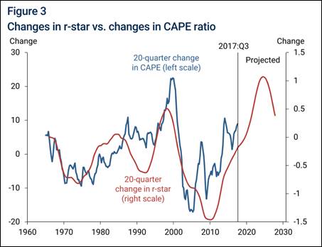
As suggested by the chart below, we suspect the interest rate part of the regression, in this case the 20-quarter change in r-star, to dominate the regression.
Big time.

This leads to a few questions :
- Does the dynamics of r* actually dominate the explanatory power of the model in statistical terms ? What does it mean in terms of traditional valuation ?
- The red line seems to lead the blue one in the first part of the sample, then lag it afterwards. Why ?
- What about testing for the stability of the regression coefficients over these two sub-samples, i.e. before and after the GFC ?
Back to the first step of the approach, the forecasting one, Lansing gives some more hints:
“The r-star series is the two-sided estimate from Laubach and Williams (2016); the potential GDP series is from the Congressional Budget Office (CBO). The CAPE ratio exhibits a mostly upward-sloping trend, particularly since the early 1980s. R-star and potential GDP growth both exhibit downward-sloping trends, but the decline in r-star is more pronounced. Beyond the end of the data sample, potential GDP growth can be projected forward 10 years using CBO estimates. Similar to the methodology in Lansing (2016), the historical statistical relationship between potential GDP growth and r-star can be used to construct a 10-year projection for the natural rate of interest. The CBO’s projection of a gradual rise in potential growth over the next 10 years implies a gradual rise in r-star to a value around 1%.” |
So GDP projections are based on the CBO estimates, that is a gradual rise of potential growth over 10 years. At the same time r* is a function of the same – gradual – projection. And what about inflation?
“The four-quarter change in the core personal consumption expenditures (PCE) price index, which removes volatile food and energy prices, is currently around 1.4%. A reasonable projection is that this measure of inflation will rise gradually to reach the FOMC’s 2% target.” |
‘A reasonable projection’ ? Looks like it’s precisely the question hiding behind the whole valuation issue.
Indeed the model captures most of the CAPE run-up as stock valuation became increasingly dependant on interest rates. Whether monetary policy normalizes smoothly or not, growth picks-up or not, and inflation misses the FOMC target or not is out of the scope of the model, unfortunately.
We suggest the following alternative propositions :
- Unconventional monetary policy has probably been the most significant valuation factor (and actor) for equities since the great financial crisis.
This proposition looks coherent with the strong correlation between the CAPE ratio and the 5Y dynamics of r* since the GFC.
- Given the level, the size and the length of unconventional monetary interventions, we would expect r* to be increasingly dependent on such policies, not the other way around.
- Policy guidance could actually explain the change in the lead-lag structure between r* (the red line) and the CAPE ratio (the blue line) since the GFC.
Isn’t forward guidance precisely supposed to work this way? The same would probably apply to volatility.
- Likewise, what about introducing credit (2)as an additional explanatory dimension along growth and inflation ?
Our best guess would be that credit influences the whole dynamics of equity returns.
And this topical question surrounding growth forecasts : which reasonable projection should the CBO make for credit ?
Jacques
(1) Abstracts from the Federal Reserve Bank of San Francisco’s Stock Market Valuation and the Macroeconomy, Economic Letter 2017-33, November 13, 2017. The opinions expressed in this article do not necessarily reflect the views of the management of the Federal Reserve Bank of San Francisco or of the Board of Governors of the Federal Reserve System.
(2) We take a wide definition of credit, which may cover debt, loans, leverage, carry trades, capital flows, commodities, …